
Example post
In this post, I’ll show how to create a helpful histogram of some synthetic data.
Generate Synthetic Data
We’ll start by generating 100,000 random numbers from the standard normal distribution.
import numpy as np
data = np.random.randn(100000)
Originally, I generated the numbers like this:
data = np.zeros(100000)
for i in range(len(data)):
    data[i] = np.random.randn()
My teammate for this assignment reminded me that the np.random.randn() function has an argument size which allows you to generate all the data in a single line of code. My approach is way better now, thanks!
Make the plot
Next, we can create a histogram using matplotlib:
from matplotlib import pyplot as plt
plt.hist(data,
         bins  = 50,
         color = "firebrick",
         alpha = 0.4,
         label = "fake data")
plt.legend()
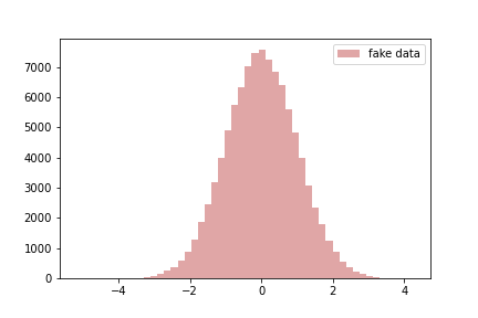
Something that I felt I did really well on this part was the use of the label argument of plt.hist(), plus plt.legend(), to create a helpful label for my data. While in this case there’s only one kind of data plotted, in other cases it can be really important to tell apart different data series. Additionally, it never hurts to analyze the plot more. I suggested to both of my team members that they add informative legends to their plots.